Fixing a hated tool by hiding 80% of features
B2B • Internal Tool • UX Research
GLPI is one of the most widely-used IT management systems in corporate environments in Latin America. Thousands of IT departments run on it, and most users complain about it daily.
Overview
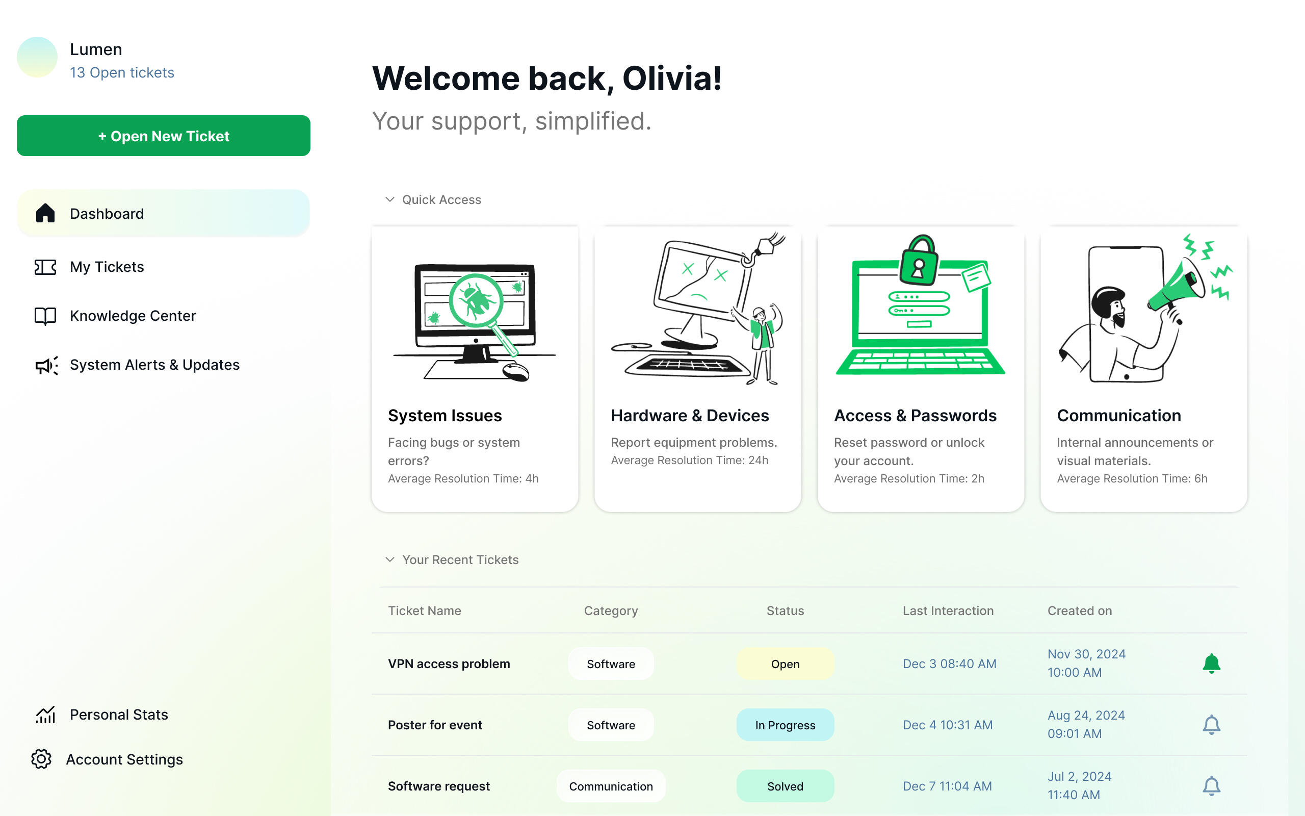
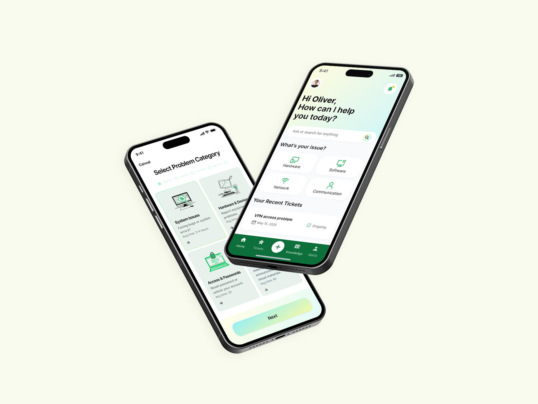
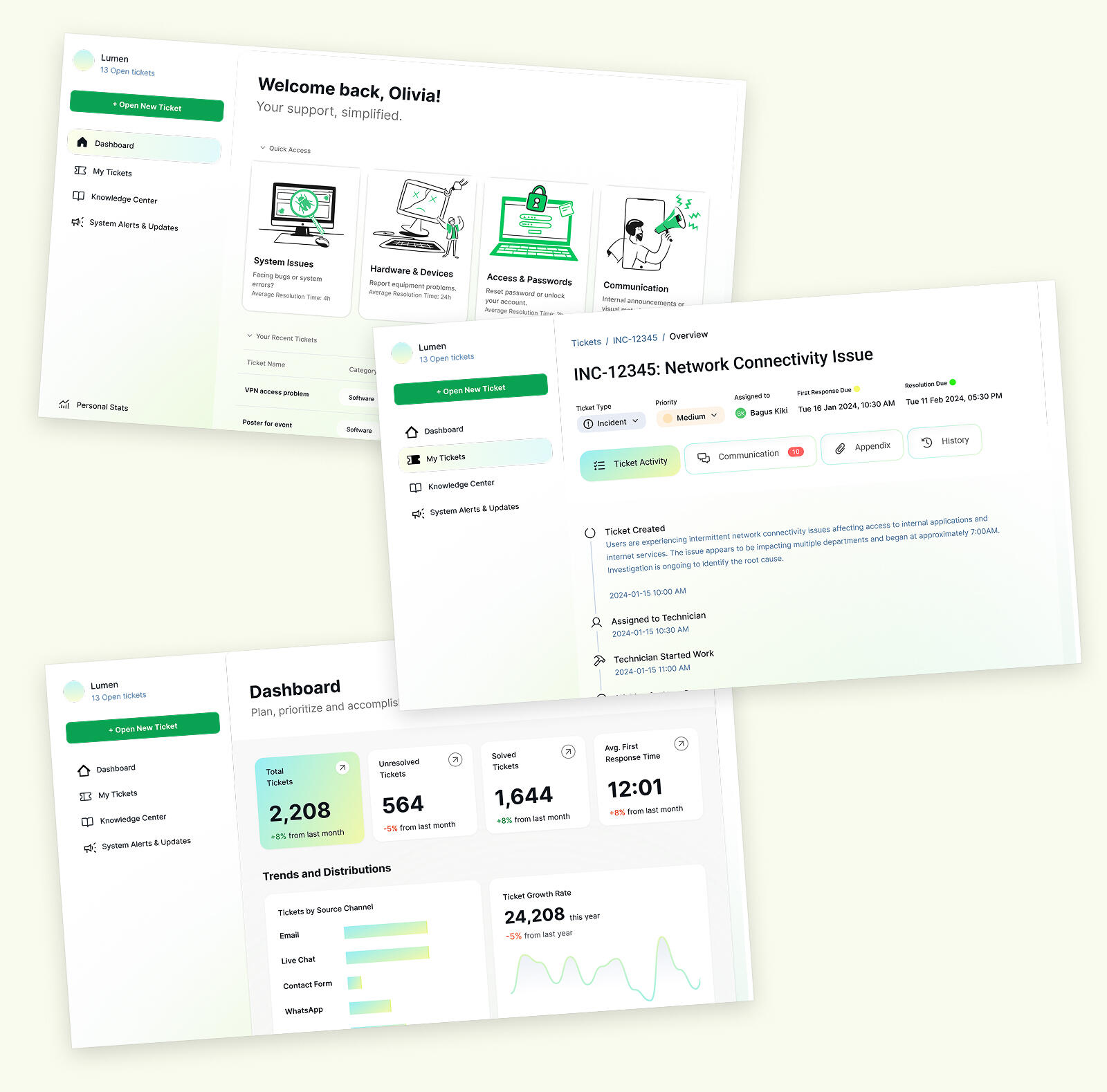
This is a conceptual redesign project aimed at fixing the core ticket creation and management experience for help desk staff and field technicians. The goal was to prove that an enterprise IT tool could work with a user's attention, not against it.
Services
UX Research
Role
Principal Designer
Plataform
Web / Mobile
The Problem
The system is exhausting. People avoid using it daily.
User Perspective
Opening a single ticket takes 8–12 clicks. Field technicians, who spend 60% of their time away from their desks, have no real mobile experience. The forms demand 15–20 fields per ticket when only 5–6 actually matter for the immediate task.
Business Perspective
IT professionals lose around 2 hours a day to navigation and data entry. Because the workflow is too complex, 58% of end-users bypass the system entirely (using WhatsApp or email), resulting in inconsistent data and making IT reports unreliable. Onboarding new staff takes 3–4 weeks.
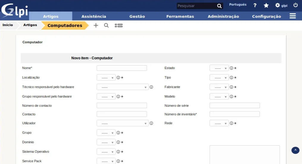
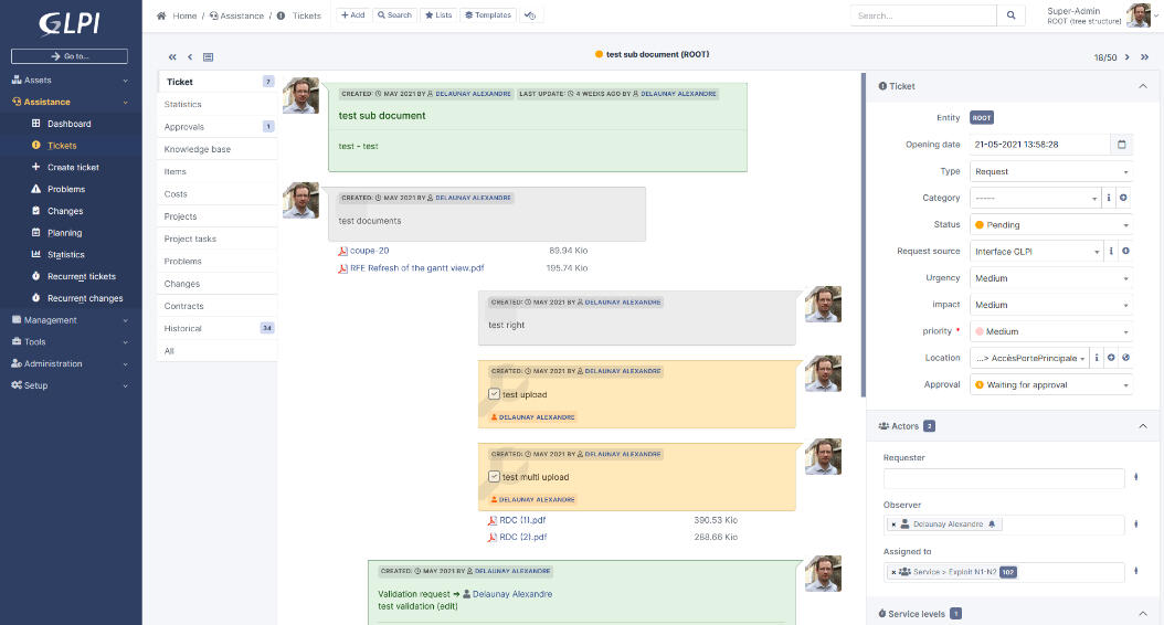
GLPI interface showing the complexity and information density that frustrates users
Conflict of Forces
Administrators
Who want comprehensive, standardized data collection.
Technicians
Who needs speed and mobility to fix problems quickly.
Option A
Redesign the existing GLPI forms to be visually modernized and mobile-responsive, keeping all mandatory fields and workflows intact to ensure 100% data fidelity.
Option B (chosen)
Change the logic entirely—surface what matters right now and hide everything else behind progressive disclosure. Build a "quick ticket" mode.
Why I Chose This Path
Because my research showed that 78% of tickets followed just 5 standard templates.
Trade-offs
I sacrificed immediate, granular data collection flexibility on the initial screen. Administrators might have to click "expand" or do secondary follow-ups to get edge-case data. I traded theoretical data completeness for actual adoption and speed.
Results
NPS 52
Excellent for B2B enterprise software.
Adoption Intent
76% would recommend testing Lumem to their teams, and 57% said they'd switch immediately after a pilot.
Time Saved
60% reduction in perceived ticket creation time (dropping from 5–7 minutes down to 2–3 minutes).
What Improved
- Ticket creation time was drastically cut by over 50%.
- Mobile accessibility for field techs became a native, frictionless part of their workflow, rather than an afterthought.
What Worsened
- Migration complexity increased: By drastically changing the data input flow, aligning the new interface with years of legacy GLPI data became a non-trivial engineering challenge.
- Communication flow ambiguity: During validation, 5 participants weren't sure how to message the ticket creator directly from the condensed view. In the next iteration, I would add a much clearer "quick-message" affordance for direct communication.